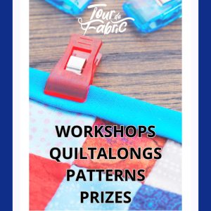
Tour de Fabric 2025 – It’s not too late to join in!
If you’re not already enjoying the fun, it’s not to late to join the Tour de Fabric 2025! It’s a free online quilting event running through the entire month of July, featuring a hand-picked lineup of over 20 talented teachers. Each of us is sharing a workshop and/or a month-long quiltalong to help you explore, play, […]
Read More
Cotton Cuts and the Value of Value
“Color gets all the credit, but value does all the work.” I don’t know who first came up with that quote; but I’ve seen many, many versions of it – because it’s so true! Most quilt books have a section on how to choose colors for a quilt. Color theory can be very helpful, but […]
Read More
Quilts on the Grand 2018
So I’ve been offline for a bit, for both good and not-so-good reasons. First, the good – John and I took a WONDERFUL trip to the Finger Lakes region of New York to stay with my sister and brother-in-law. While we were there, we were also able to get together with my parents and with […]
Read More
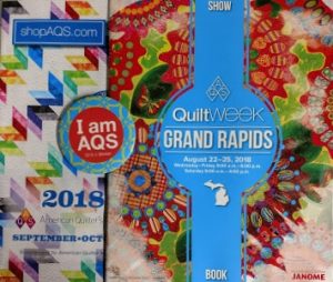
AQS Quilt Week Grand Rapids 2018
From the American Quilter’s Society website: “AQS QuiltWeek events are held in multiple cities across the country. These events make an indelible mark on the fiber art community by offering the largest cash prizes for quilters in the country, thanks to our generous sponsors! In additional to displaying the contest quilts at each event, attendees […]
Read More
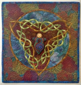
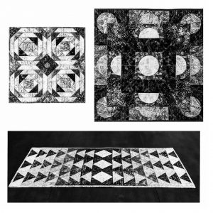
Journal Quilts with Celtic Knotwork
2025 UPDATE: My Celtic patterns can now be found in my online shop. To me, Journal Quilting is a handy shorthand way to describe quilting as a vehicle for personal reflection and expression. Although I impose no size restrictions on myself, the pieces are generally on the smaller side, which better lends itself to a sense […]
Read More
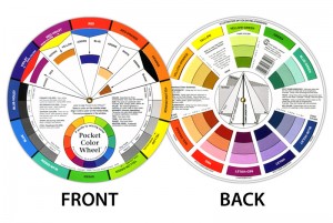
Quick Tips for Making Color Theory Work for You
Do you ever struggle with something you are creating, just knowing that something is off or missing, but not sure what it is? Both from personal experience and from that as a long-time instructor, I find that quite often this has to do with color and value choices. Color theory to the rescue! But sometimes color […]
Read More
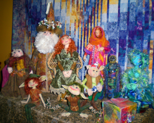
Fun with Cloth Dolls & Figurative Art
Although I make my living primarily by designing, teaching, and writing about contemporary quiltmaking, I’ve become a most enthusiastic dollmaker and mixed-media and surface design enthusiast, as well. I find working with the figure (human or non-human) to be very therapeutic, as well as lots of fun. Although my quilts are all original designs, at […]
Read More
Mosaic Fabric
I’ve always been fascinated with the interplay of color, value and visual texture of mosaics, especially those created by artists such as Sonia King. Back in 1997, a book called Machine Embroidery: Stitched Patterns by Valerie Campbell-Harding was published by Quilters’ Resource Inc. The cover photos fascinated me – mosaics in fabric! There wasn’t a […]
Read More