Do you ever struggle with something you are creating, just knowing that something is off or missing, but not sure what it is? Both from personal experience and from that as a long-time instructor, I find that quite often this has to do with color and value choices.
Color theory to the rescue! But sometimes color theory on its own isn’t enough help…
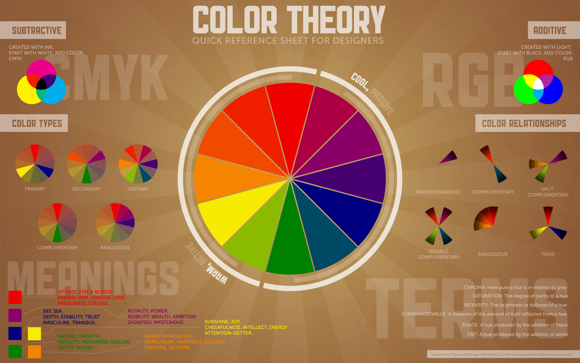
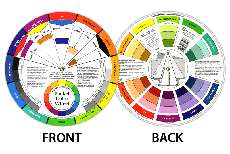
Color Theory Infographic from paper-leaf.com – a great overview!
(1) The priniciples of color theory can be of great help to any artist or creative person, as long as everyone remembers that THEY ARE NOT RULES.
They are simply tools or suggestions that may or may not be helpful in any particular circumstance.
- I love this quote from Mary Coyne Penders in her book Color and Cloth:
“Harmony is the juxtaposition of colors that go well together. Color harmonies serve as a framework on which we can build effective combinations of color and cloth for our quilts….
Rather than looking at harmonies as rigid rules, think of them as flexible guidelines that you are free to accept, reject or incorporate into your personal vision.”
- I tend to use color theory not as a rulebook at the beginning of the design process, but as a tool as I go along. It may help me refine my choices or give me insight as to what colors/fabrics might be helpful to introduce or pep things up or what fabrics it might be helpful to remove in order to create more unity or cohesion.
(2) Stand at least 6 feet away (or take off your glasses so that everything goes fuzzy) to determine what color seems dominant in a fabric with a printed design.
- Don’t overthink it and don’t worry if someone else disagrees with you – it can be pretty subjective.
(3) With any of the harmonies, please note that the colors do not need to be used in equal proportions, values, or intensities.
- You can adjust the amounts of each color relative to the other. For example: the complementary (opposite on the color wheel) colors red and green are often used in a 1:1 ratio, orange and blue in a 1:2 ratio, and yellow and violet in a 1:3 ratio.
- You can make one or more of the relevant colors lighter, darker, brighter, duller, etc., until you are happy with the combination.
- You can add neutrals – they are “freebies” when it comes to color theory, but can come in handy. Neutrals can unite, separate, or showcase colors, providing visual relief without altering the basic color relationships. When it comes to color harmonies, they are the freebies! For example: white or very light fabrics can be used to separate fabrics that feel like too much when they are side by side; black or very dark fabrics can be used to make colors “pop”.Black, white, and gray are true neutrals; however, quilters often consider beiges neutrals, as well as pale (light-value), dull (low-intensity) versions of other colors, e.g. soft browns, taupes, gray tints, and creams.
(4) It’s OK to sneak small amounts of some other colors in there, too!
- Some may disagree with me on this, but I stick with my 6 feet away rule on this, too – if the dominant colors I see are the colors in the harmony I am working with, I don’t worry about whatever else might be in there, too.
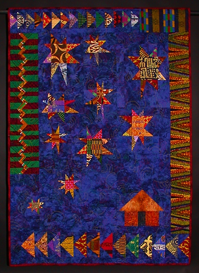
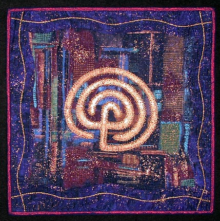
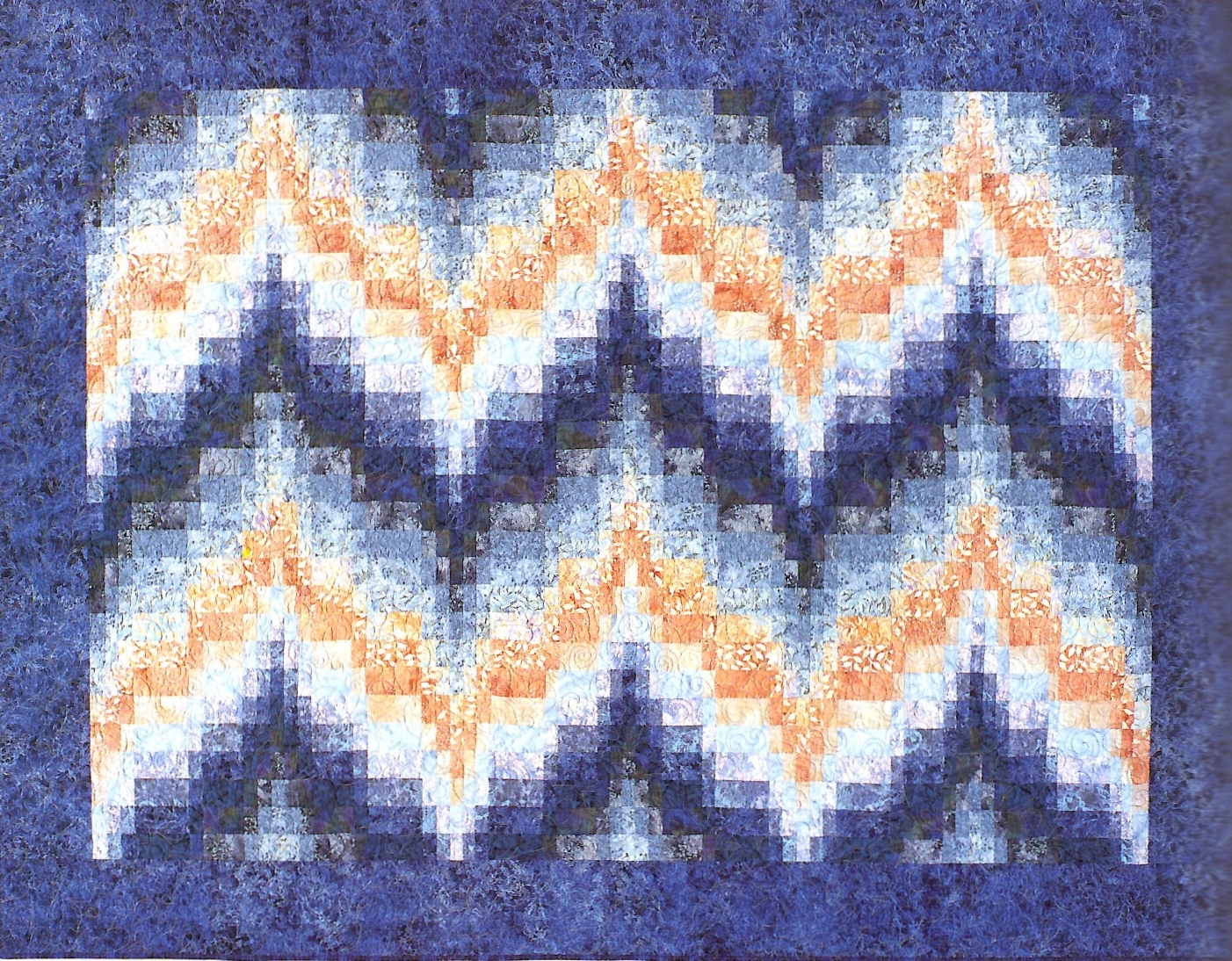
These three quilts are examples of the same complementary color pairing, orange and blue; but in each case, the colors have been adjusted in different ways:
(4) Recognize the importance of value placement.
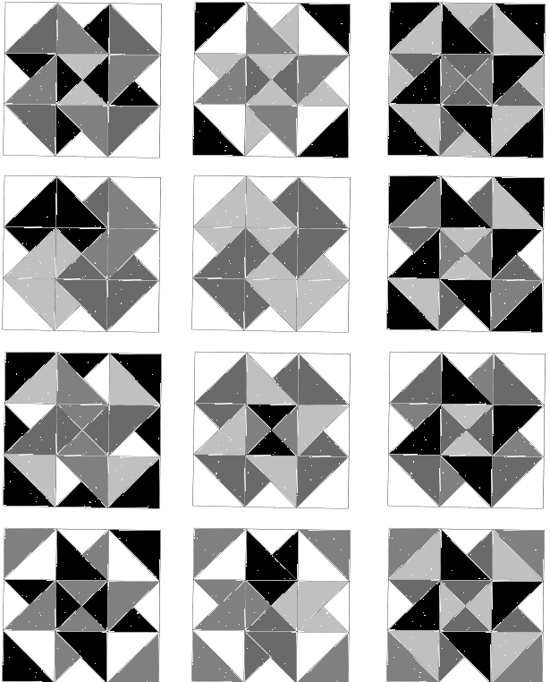
Most people recognize that simply changing the colors used in geometric quilt pattern can result in a very different looking quilt.
What they may not realize at first is that you can interpret the same exact pattern with the same exact assortment of fabrics and still achieve sometimes startlingly different results simply by varying the placement of the fabrics. This is usually a result of value placement – where the “lights”, “darks” and “mediums” go.
Changing the value placement (where the lights/mediums/darks are) creates distinctly new patterns visually, even when the underlying grid struction of the pattern is exactly the same from block to block.
And when it comes to sewing and quilting, it is important to recognize that fabrics interact with each other–affecting our perception of their relative colors, values, and intensities. Sometimes a fabric that reads as “dark” in one area may read as “medium” in another area. Likewise, a “light” fabric may read as “dark” when it is presented against a white background.
(5) First of all, please yourself.
In other words, if a particular combination of fabrics really floats your boat, then it is a good one for you, regardless of what anybody else might think. Bask in the moment, and then move on to start your project.
Some quiltmakers make quilts that sing and even shout. Others make quilts that whisper. Most of our quilts seem to fall somewhere in between.
Some quiltmakers are perfectly happy making quilts exactly like those appearing in the patterns or books they buy. Others need to feel that each piece is an original work of art. Again, most of us fall somewhere in between.
What we must remember is that we need to allow ourselves–and each other–room to grow and explore.
“Intuitive” use of color is usually not based primarily on some inborn talent, but is developed through experience.
So start playing!