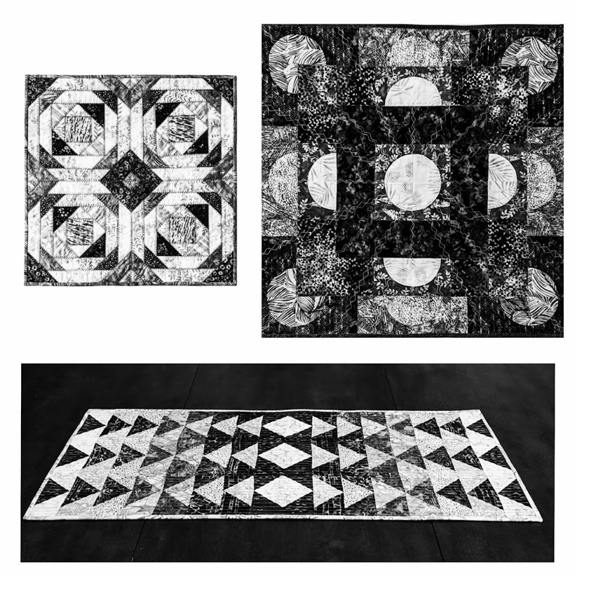
“Color gets all the credit, but value does all the work.”
I don’t know who first came up with that quote; but I’ve seen many, many versions of it – because it’s so true!
Most quilt books have a section on how to choose colors for a quilt. Color theory can be very helpful, but what often gets lost in the discussion is the importance of value – how light or dark a given color (or piece of fabric) may be, and how differences in value and value placement can be used as a primary design element.
Today I’d like to briefly share some of my recent exploration in using value to define individual shapes within an overall pattern, establish focal areas, and create depth and luminosity.
But first I’d like to back up for a second and talk about a different kind of value…
Cotton Cuts is one of those special companies that you not only feel good about supporting because of the quality of their products, but you can also feel good about supporting their mission. They offer a variety of monthly subscription options for top-quality quilting-weight fabric and Aurifil thread. They also have a 10-month mystery quilt; an online shop with additional thread, fabric, and patterns; and host the #CCColorChallenge on Instragram.
From the Cotton Cuts website:
“Cotton Cuts is on a mission to create jobs. We have partnered with a local workshop that provides dignified employment opportunities to the intellectually challenged and to those with other disabilities. Every Cotton Cuts membership that you purchase contributes toward enriching the lives of these very talented individuals.”
“Build your stash while feeling good about it!”
As a newly minted Cotton Cuts Brand Ambassador, I received my first box of goodies back in March. What fun! Each box I’ve received so far has had different color theme.
Here’s my March Java Batiks unboxing video:
And here’s a video I posted of my April Java Batiks box:
When the May box arrived, Ronan was ready to step in as spokes-kitten. 🙂
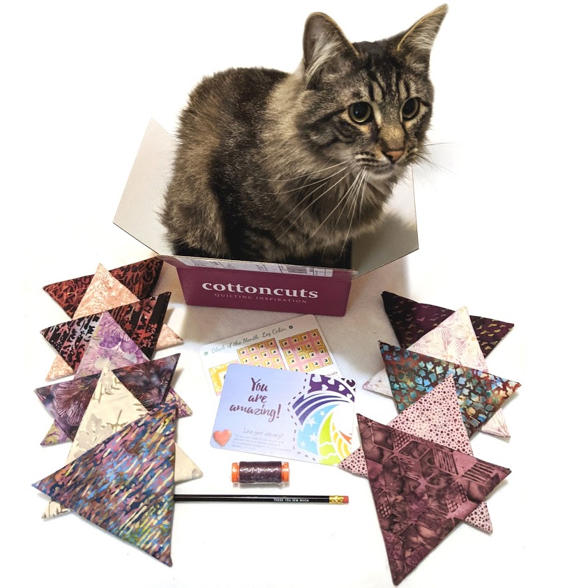
Under the guidelines for Brand Ambassadors, I am allowed to create whatever I want with the fabric enclosed – but I am not allowed to add additional fabric, with the possible exception of a solid neutral.
This has been an interesting challenge for me, as I typically think first about line, then color, and then value, when I design. And I like lots of color! But because each of these bundles was fairly monochromatic (various shades of the same color or very closely related colors), I had to think first about value – the relative lightness or darkness of each of the fabrics, and how I could create interesting designs by using shapes with high contrast in some areas and lower contrast in others.
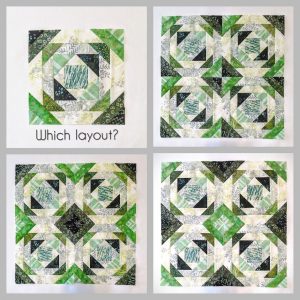
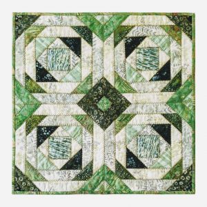
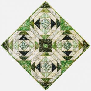
In March, I gave my FB and IG followers the option of voting on which layout I would use for a grouping of 4 identical blocks in the traditional Pineapple Log Cabin pattern.
When you remove the color, it is easy to see how the contrasts in relative values create the design.
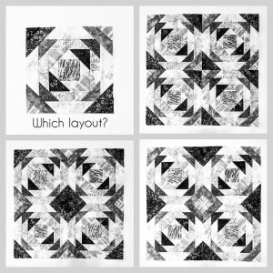
Incidentally, the voting was of no help whatsoever – the bottom two options received the exact same number of votes and the upper right option was only a few behind.
I ended up combining the general layout of the bottom left with the light central focal point of the bottom right. 🙂
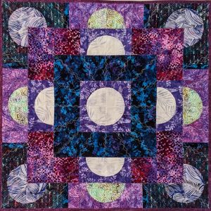
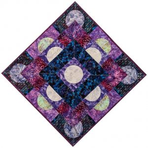
Here are the three Cotton Cuts Java Batiks projects I’ve created so far shown in black & white so that you can clearly see how I’ve arranged the relative values:

And here they are in color!
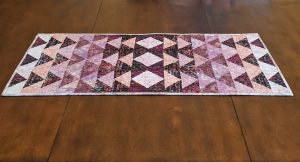
I’m already looking forward to the next box! 🙂