)

Choosing quilt fabrics can feel overwhelming — especially when you’re staring at a fabric pull full of beautiful options and wondering why they don’t quite work together.
If you’ve ever searched for:
- How to choose quilt fabrics
- How to coordinate quilt fabrics
- Why my fabric pull looks wrong
- How to mix prints for a quilt
You’re not alone!
The good news? Fabric selection doesn’t have to feel mysterious or stressful. In this guide, I’ll walk you through a simple, beginner-friendly framework that helps you build a balanced fabric pull with confidence.
A Simple 3-Step Method for Choosing Quilt Fabrics
Instead of starting with dozens of fabrics and hoping they work, try building your fabric pull in layers:
- Choose a Focus Fabric
- Add Supporting Fabrics
- Add Background or Neutral Fabrics
This structure gives you a starting point — and once you’re comfortable, you can absolutely bend or break it.
Step 1: Choose a Focus Fabric (The Star)
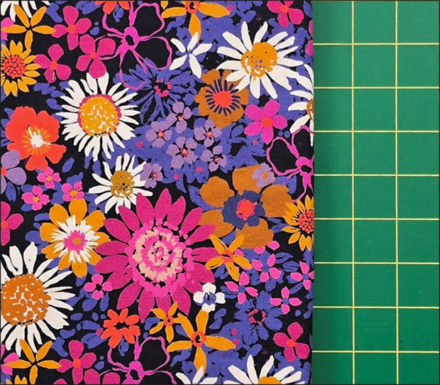
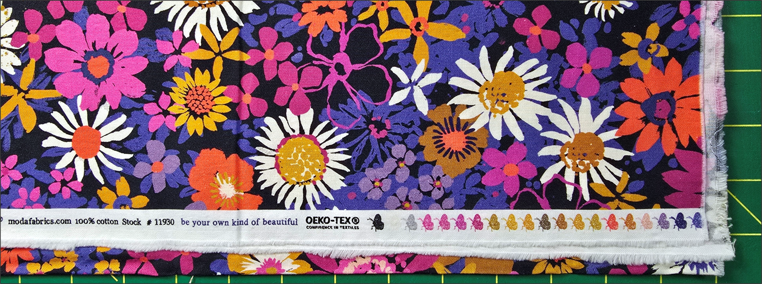
Start with one fabric you truly love.
This is usually a medium-to-large scale print that contains multiple colors. It becomes your “anchor” and limits your choices in a helpful way.
Why start here?
Because it reduces overwhelm. Instead of choosing from everything in your stash (or in the store), you’re now choosing fabrics that coordinate with this one piece.
Look at the colors in the print (the selvage dots can help if you still have them). Those colors become your roadmap.
Step 2: Add Supporting Fabrics
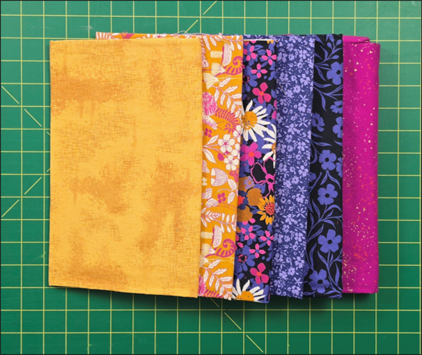
Now pull 2–5 fabrics that coordinate with your focus fabric — but don’t compete with it.
When mixing prints for a quilt, pay attention to:
- Color – Pull colors directly from your focus fabric, but don’t be afraid to go lighter, darker, brighter, or duller.
- Scale – If your focus fabric is large-scale, look for medium-scale prints and small-scale prints and subtle textures.
- Intensity – Mix bold fabrics with quieter ones.
If everything is bold, nothing stands out.
Supporting fabrics should feel like they “belong at the same party,” without fighting for attention.
This is often where fabric pulls fall apart — when multiple large, busy prints compete for the spotlight.
Step 3: Add Background or Neutral Fabrics
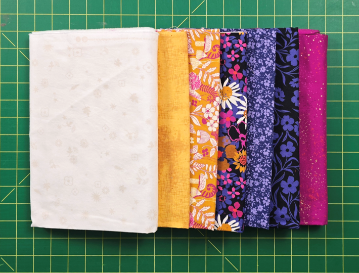
Background fabrics are often underestimated, but they do essential design work. They give your eye a resting place and allow your main fabrics to shine.
Common background options include:
- White or cream
- Gray
- Pale versions of colors already in the quilt
- Low-volume prints
- Navy, charcoal, or black (for lighter and brighter palettes)
The key question to ask is:
Does this fabric increase contrast and help separate the others clearly?
Without a background or neutral, a quilt can feel busy or chaotic — even if the colors technically “match.”
Do the Stand-Back Test
Once you’ve pulled your fabrics, step back at least six feet.
Ask yourself:
- What stands out first?
- Is that what I want to stand out?
- Do I have at least one noticeably lighter fabric?
- Do I have at least one noticeably darker fabric?
A clear range in value (light to dark) is what keeps a quilt from feeling flat.
If something feels off, try:
- Removing one fabric
- Replacing a bold print with a quieter one
- Keeping the bold print but adding a “quieter” friend to help smooth the transition
- Expanding your background fabric
Small adjustments often make a big difference.
If you’d like to see this method demonstrated step-by-step — including additional fabric pulls from my own fabric collection — you can watch the full video here:
Watch the Full Video Tutorial:
BONUS: Why Quilt Fabrics Sometimes Clash
If your fabric pull doesn’t look right, it’s usually not because your colors are “wrong.”
Common issues include:
- Not enough contrast
- All fabrics being the same scale
- Too many bold prints competing
- No visual resting place
- Too little light/dark variation
Using a structured approach helps prevent these problems before you start cutting.
For my Quilting Friends members, there’s also a printable planning sheet that walks you through this process in a clear, actionable format.
Happy Quilting!