This is the tenth in a series of sew/quilt-along posts about making a bargello quilt.
I am following the pattern for Cascade, the most beginner-friendly pattern from Colorwash Bargello Quilts.
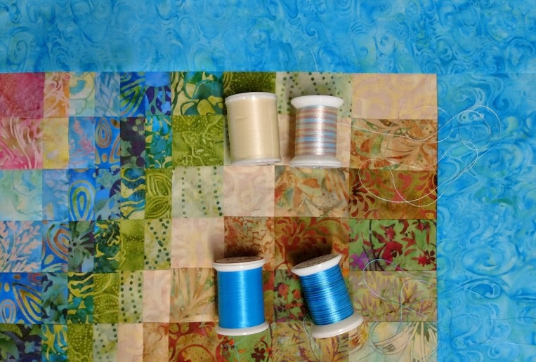
The quilt top is complete, and as I discussed in my previous post, I’ve decided to free-motion quilt this project. I’m raring to get started! I’m leaning towards a variegated thread that has a nice sheen. Although you don’t usually notice the color of the thread used for the quilting until you are right up close, it can have significant impact on the finished quilt.
A quick refresher for a few of my readers who aren’t quilters:
- A “quilt” is traditionally composed of 3 layers: quilt top (which may be pieced together, appliquéd, or whole-cloth), the batting (I’ll be using 80/20 Hobbs Heirloom Cotton batting), and the backing fabric.
- “Quilting” refers to the stitching (by hand or machine) that is done to hold the 3 layers together.
- “Free-motion” quilting refers to dropping the feed dogs (the feed dogs are what normally moves the fabric through the sewing machine as you sew) and creating a design by moving the fabric manually (kind of like drawing on paper, except in this case, the pencil/machine is stationary and the paper/fabric is what moves).
A few of my personal observations about my thread choices:
- I like thread with a bit of shine! In my early days, I often used rayon thread, but I switched to high-quality trilobal polyester threads such as Isacord, Rainbows, and Fantastico (the latter 2 are from Superior Threads) as they became available. These newer threads have beautiful sheen, are reliably colorfast, virtually lint-free, and are much less likely to shred or break while you are stitching. (Note: you may still get lint build-up in your machine from your batting and backing, as well as from your bobbin thread, if you are using cotton.)

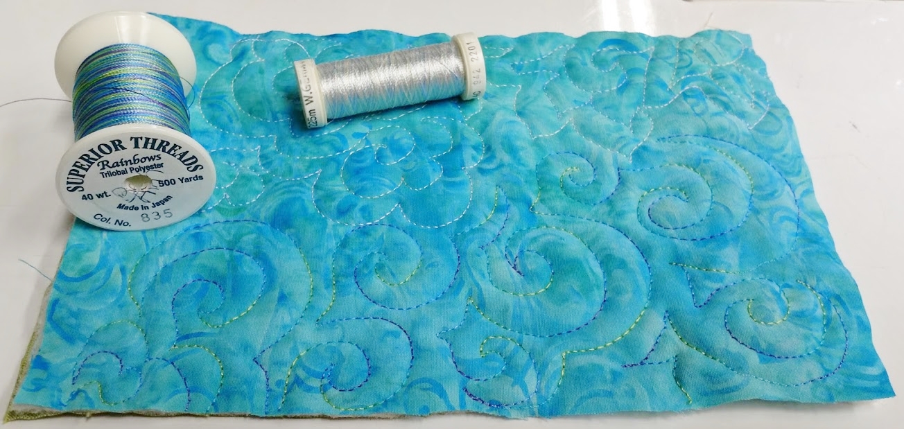
I like the subtle sheen this thread adds to the quilt. The pastel color changes show up a little better in person than they do on camera. - I especially enjoy variegated thread – especially brands such as Rainbows or Fantastico, both of which change color every inch.
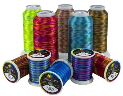
Fantastico thread from Superior Threads
- I like to use color as a unifying element. As I’ve mentioned before, mid-to-high density quilting with a color (or colors) – as opposed to matching the thread color to the fabric or using clear MonoPoly – subtly changes the color(s) of the fabrics underneath.
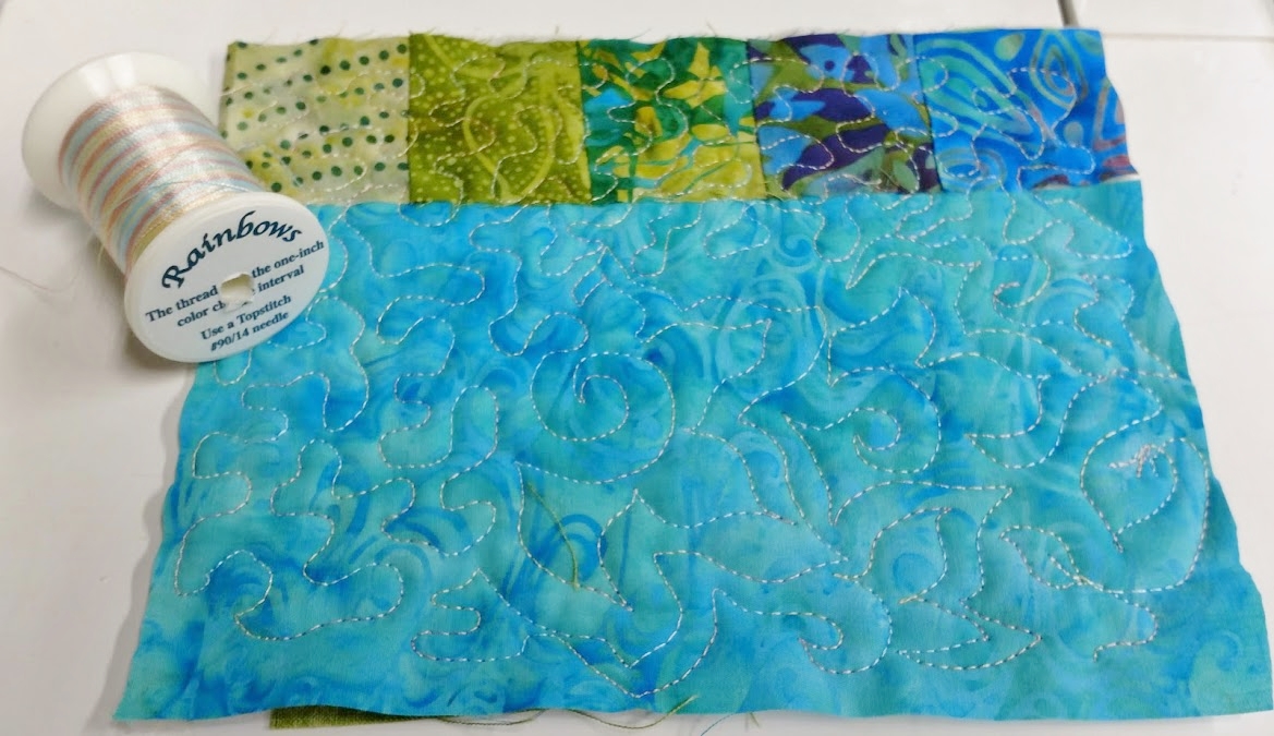
This thread adds sheen but not color to the border. I think it dulls the lighter fabrics a little bit, though. - Unlike some quilters I know, I particularly like choosing a variegated thread which will give the illusion of flickering in and out of sight because of the way the changing colors in the thread briefly match and then contrast with the color(s) of the fabric underneath.
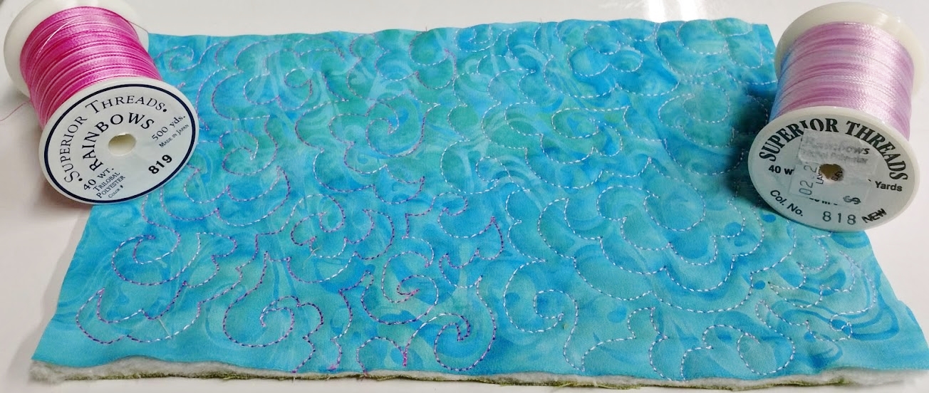
The green/blue/purple thread seems to flicker in and out of view compared to the lighter thread with lower internal contrast. - I find I am happiest with the tension of my stitches when I have a slightly finer weight thread in the bobbin. For example, if I am using Isacord, Rainbows, or Fantastico (which are all 40 wt. trilobal polyester) thread in my needle, I get great results on my machine with Bottom Line (which is a 60 wt. filament polyester) in my bobbin. (Note: thread weights are counter-intuitive: all-purpose thread is 50 wt., 40 wt. is heavier, and 60 wt. is finer.)
Two of the thread combinations I am considering. In each case, the variegated Rainbows thread would be the top thread and the coordinating solid color of Bottom Line thread would be in the bobbin. - I find sample stitching incredibly helpful – I layer scraps of the same fabric(s) used in the quilt top with some scraps of batting and backing fabric and then try out different threads I am considering. Variegated threads can surprise you – the colors often look quite different when they are stitched out than they do when the colors are all tightly packed together on the spool!

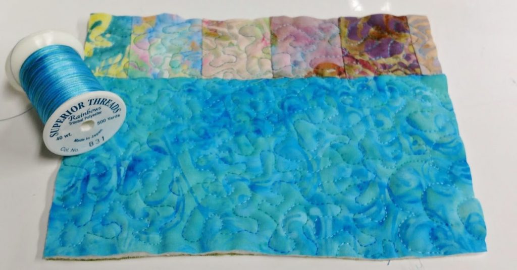
The darkest pink in the pink thread on the left reads almost purple against the blue of the border, while the color variations in the lighter thread are very difficult to see. 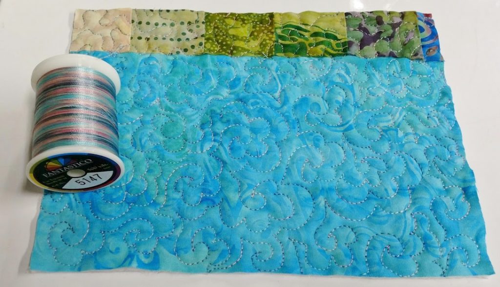
I think this thread is much more appealing when it is stitched out than it is on the spool! 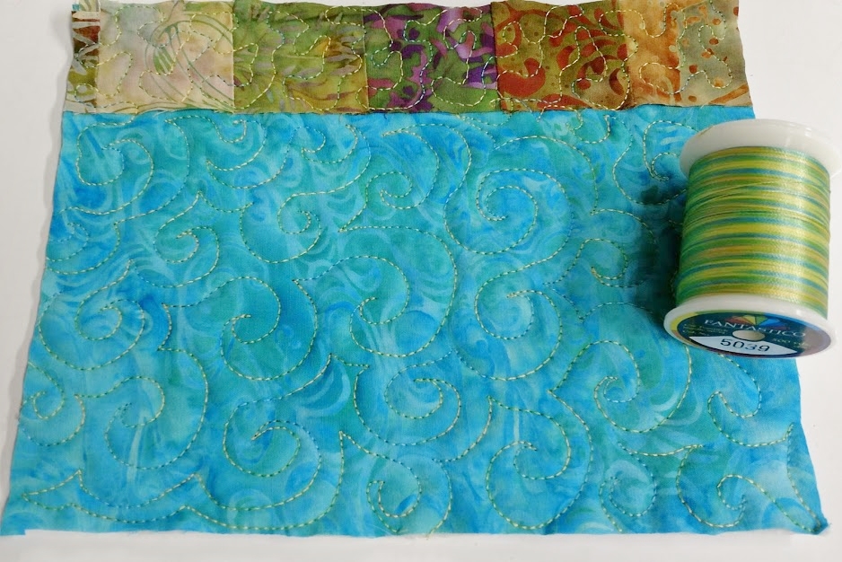
These colors feel so happy to me – and I like the way there is enough contrast to pick up the color changes, but not so much that it is jarring. A definite contender. Might not be so good on top of the pinks, though.


So which thread will I use? I think I’ll sleep on it…. 😉